Visual identity
for Hampden Bank
Collaboration with the designer Seth Josephs in the total design rebranding of the Hampden Group, UK financial services company who mix a modern approach with traditional values.
The mission
Bringing a classic sensibility to a contemporary and modern brand. The old and the new. Refinement of the logo, stationery, art direction of photography and complete re-design of the website.
The outcome
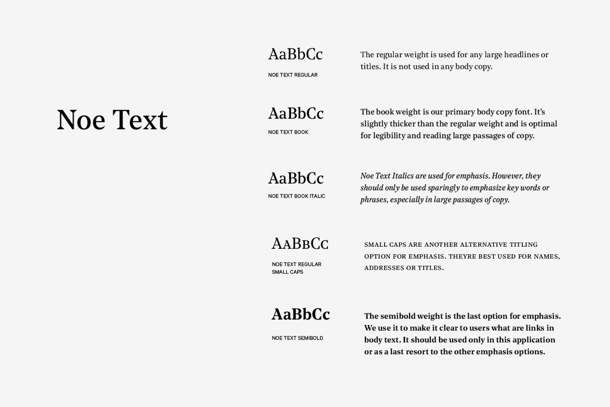
Unconventional layouts that break from the grid, or overset type on imagery provides a modern contrast to the very classic, historic feel of the typography. The layout contrasts well with the classic style of the typography and imagery and brings a modern edge to the interface.


UX Strategy
The website has been designed to provide both current and prospective clients the easiest flow through the website — the flow connects users to the right service and leads them to make contact either with an individual or through a general enquiry form.
A modern website with a classic feel
Hampden is a business that upholds traditional values and fuses them with modern ways of working. The website carries this ethos by taking a print and editorial inspired approach to the layout and components — bringing a classic sensibility to a contemporary and modern website.
An editorial approach
The interface straddles the line between classic and modern. Columns of text, like newspapers or magazines aid legibility and give structure and balance to the layouts.


Simple to search
The search field opens full screen with large type. It also automatically fills your search from a selection of defined keywords to help users. Results are displayed instantly, so there’s no need to wait for a search results page.
Easier to skim read
Users rarely ‘read’ the web. Rather users scan pages. The new layout structure helps users to quickly find what they are looking for and breaks up dense content into simpler, digestable ‘bites’ of information.


