Foleon demand strategy Industry campaigns
Collaboration with the Demand Generation team to create concepts for paid advertising that target all industries and audiences at various stages of the sales funnel.
As the creative lead, my responsibility was to determine the creative direction that we wanted to pursue. This project marked my first experience using AI tools to create visuals from scratch. Working alongside our senior copywriter, we finalized ads for different industry targets.


MORE ADS COMING SOON
MORE ADS COMING SOON
Competitive Campaign

Overview
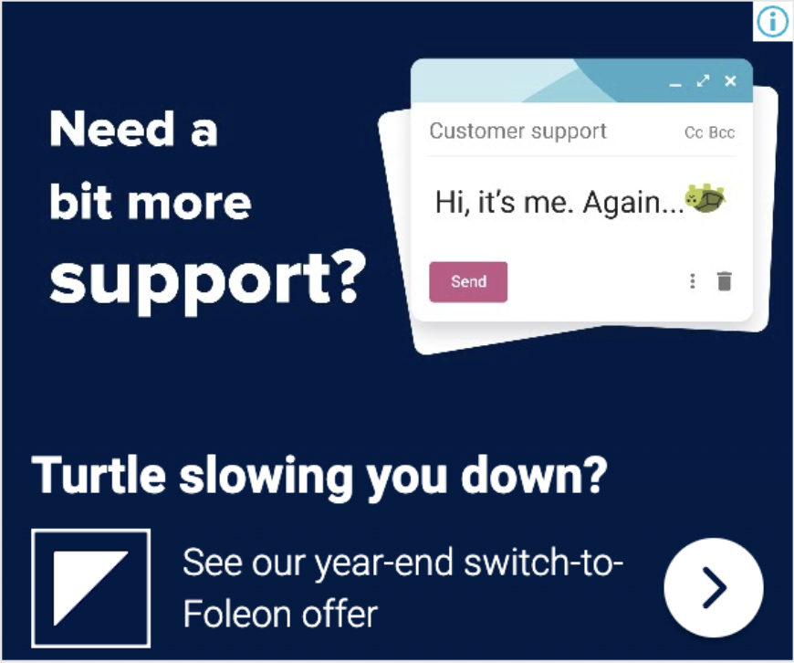
We want to capitalize on the many dissatisfied Turtl customers. We want to challenge Turtl on the various pain points their users experience without being offensive. We opted for a tongue-in-cheek, read between the lines approach.
We run search and display ads (but not social) that lead to our Turtl Competitor LP, targeting people searching for Turtl / Turtl alternatives.


Approach
What are the pain points?
Tool not as flexible as you thought / doesn’t do what you thought. You can’t really design with it. Just create cookie-cutter flip books. We are way more powerful from a creative freedom standpoint
Customer service is reportedly bad. They are trying out self-service / PLG strategies and/or make promises they can’t keep.
Because the ads target Turtl customers/prospects, it’s important that they are triggered to think about the Turtl product and consider the challenges, but without us appropriating their visual identity or using the name “Turtl’’ (Google will not allow that).
Playful use of terms like “slow” and “clumsy,” coupled with an image of a turtle on its back, allows us to make inferences about their product and support while sounding funny rather than mean.
Analysis of the old ads

The PDF, with a sad expression, effectively conveys the idea of an outdated solution. However, the FD (Folen Doc) illustration is unclear in how it distinguishes itself from the PDF. For first-time users, it may not be immediately evident what FD stands for, and it appears to be the same visual as the PDF, just presented in a different color.
The ads heavily feature illustrations. However, it's unclear what our product is and what we offer. The copy is straightforward, but the visual style may come across as childish.